Visual
identity

Logo
DownloadOur logo is one of the most visible elements of our identity and helps to align our branded touch points to tell a more cohesive story.
Primary logo
Image mark
Logo clear space and minimum size
To ensure high visibility and an uncluttered presentation, always maintain clear space around the Gator logo. Determine clear space by measuring the height of the “g” letterform in the logo (see diagram) and keep a square area equal to this height clear on all sides of the logo. Note that the clear space will change depending on the size of the logo.
Logo color usage
Primary color applications


Logo incorrect usage
To maintain the integrity of the brand, avoid manipulating or modifying the Gator logo. These examples are select instances of incorrect usage of the logo.
Color palette
DownloadConsistent use of color will help unify all applications of the Gator Bio brand. Our color system provides a modern and sleek look, and an overall presentation distinct from others in our industry. Remember to use RGB or Hex values for digital tactics only and CMYK or PMS values for all printed materials.
Primary color palette
- PMS 5463 C
- CMYK 100.45.38.90
- PMS 5463 U
- CMYK 95.48.48.45
- RGB 0.36.44
- HEX 00242c
- PMS 7488 C
- CMYK 52.0.82.0
- PMS 7488 U
- CMYK 56.2.85.3
- RGB 111.225.71
- HEX 6FE147
- PMS 2254 C
- CMYK 29.0.35.0
- PMS 2254 U
- CMYK 32.0.35.0
- RGB 222.246.218
- HEX DEF6DA
Secondary color palette
- PMS 2216 C
- CMYK 88.50.45.50
- PMS 2216 U
- CMYK 73.0.9.73
- RGB 36.69.74
- HEX 24454a
- PMS 785 @60% tint C
- CMYK 17.0.24.0
- PMS 785 @60% tint U
- CMYK 17.0.24.0
- RGB 180.241.179
- HEX b4f1b3
- PMS 7485 @40% tint C
- CMYK 6.0.9.0
- PMS 7485 @40% tint U
- CMYK 6.0.9.0
- RGB 235.250.233
- HEX ebfae9
- PMS 333 C
- CMYK 49.0.28.0
- PMS 333 U
- CMYK 58.0.37.0
- RGB 80.240.207
- HEX 50f0cf
- PMS 331 C
- CMYK 27.0.15.0
- PMS 331 U
- CMYK 33.0.20.0
- RGB 174.248.233
- HEX aef8e9
- PMS 7416 C
- CMYK 0.69.65.0
- PMS 7416 U
- CMYK 1.62.73.0
- RGB 255.108.75
- HEX ff6c4b
- PMS 7415 C
- CMYK 0.28.26.1
- PMS 7415 U
- CMYK 0.28.29.1
- RGB 255.200.180
- HEX ffc8b4
- PMS Process Black C
- CMYK 0.0.0.100
- PMS Process Black U
- CMYK 0.0.0.100
- RGB 0.0.0
- HEX 000000
- PMS 420 C
- CMYK 9.5.8.16
- PMS 420 U
- CMYK 28.19.19.2
- RGB 238.239.239
- HEX eeefef
Color pairings for text
Acceptable color/text pairings
To ensure our content is cohesive and accessible, these color pairings are some of the recommended options for pairing color and text. For color pairings not shown below, please snap to AA web accessibility guidelines.
Primary text pairings
Unacceptable color/text pairings
These are some—but not all—instances of color pairings to avoid.
Typography
Typography is an important aspect of our brand identity. Our type styles contribute
to our overall modern aesthetic. Please contact the Marketing/Communications team to access fonts.
Primary fonts
Only use selected weights: Regular and medium

Only use selected weights: Medium and demibold

Only use selected weights: Regular, medium, demibold, and bold

Alternate fonts
In instances when primary fonts are not available, the following approved Alternate Fonts are acceptable substitutes. These will typically be used in slide presentations, text documents, email templates, and other situations when primary fonts are not available.
Only use selected weights: Regular and bold

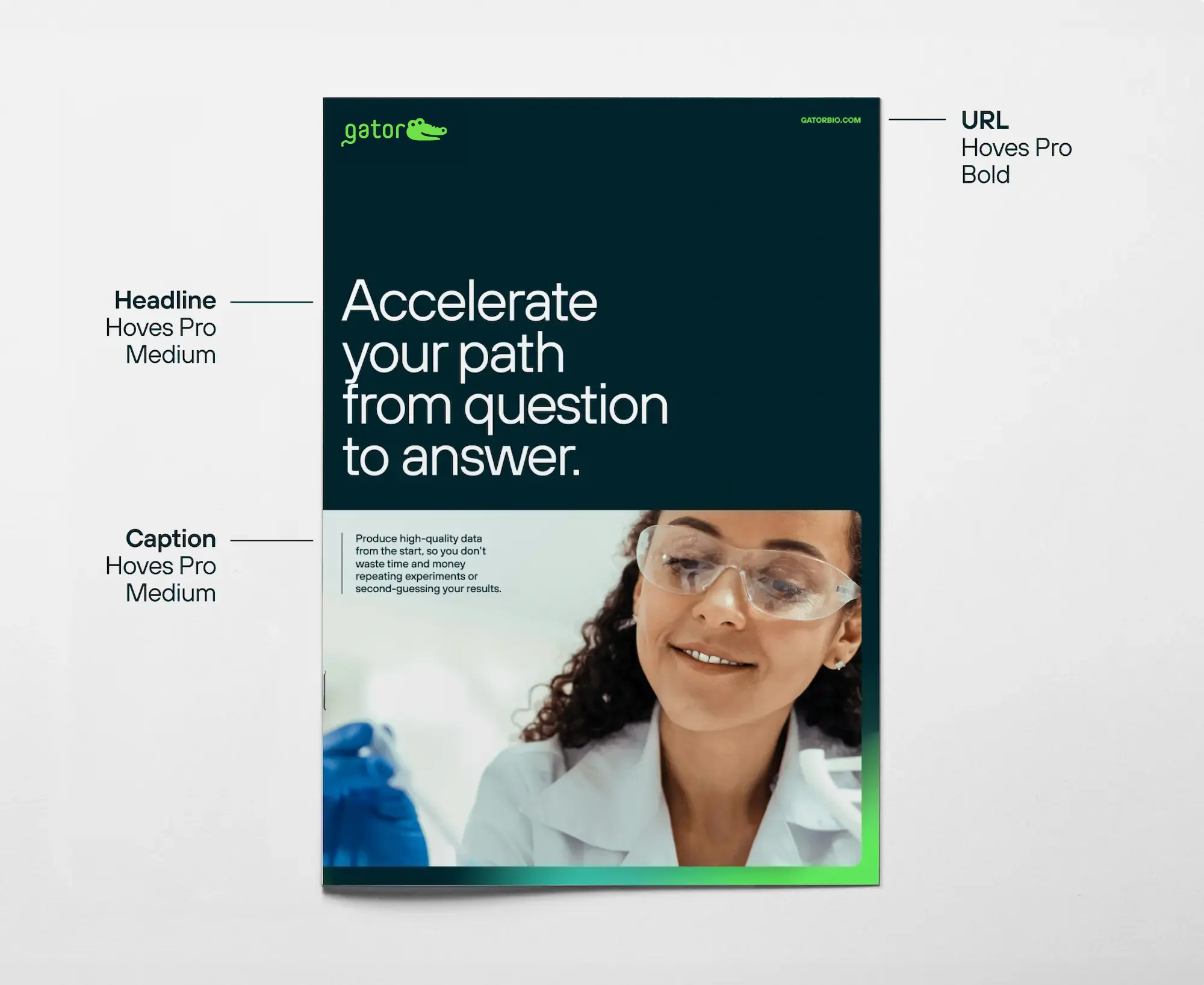
Type hierarchy
Type hierarchy is important to establish balance and direction of messaging to our customers.
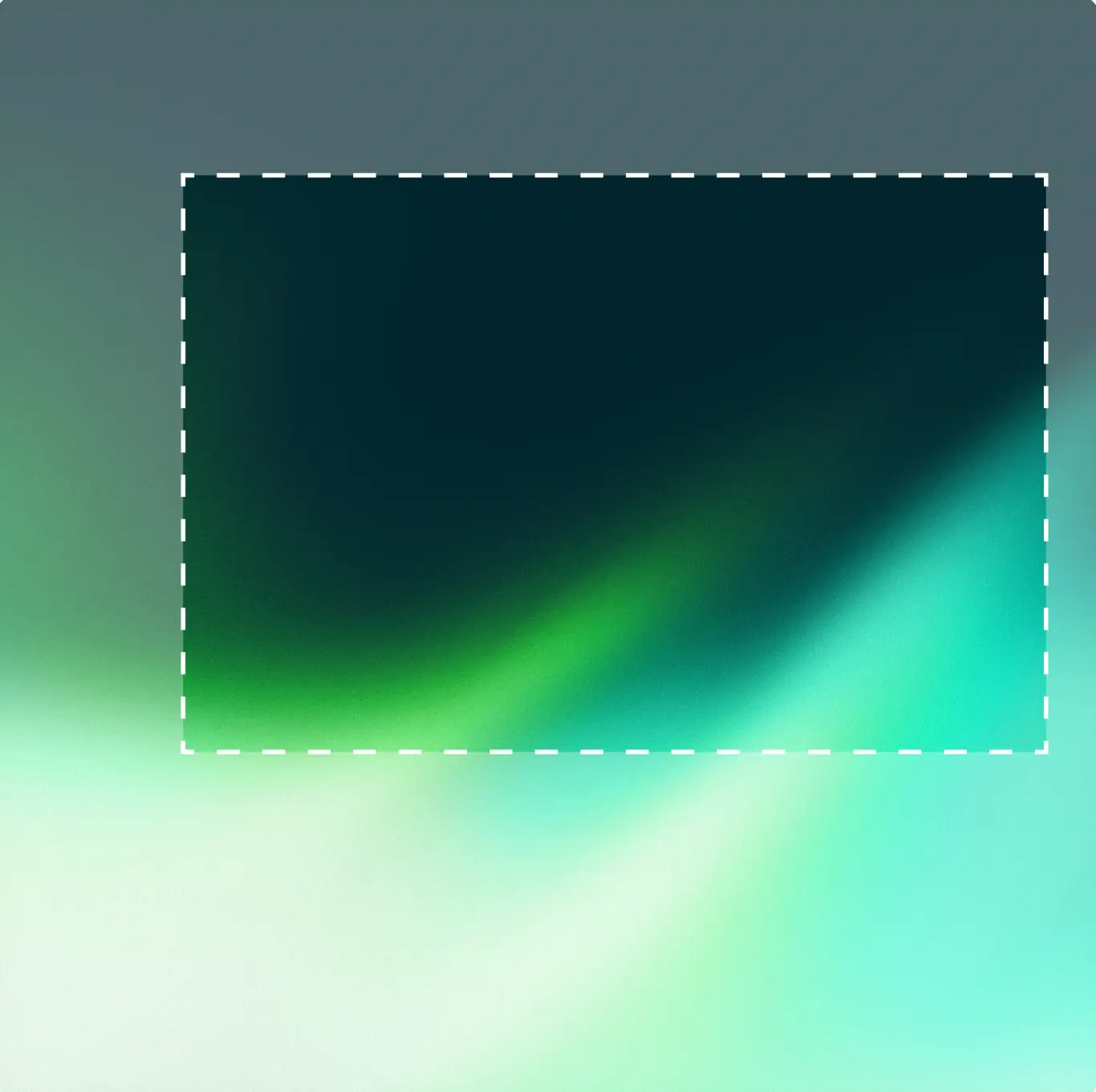
Light gradients
Our ambient light gradient imagery is a visual device used to draw focus to a key visual or message.


The gradients are made from the analogous colors of greens and blues from our palette as well as white.
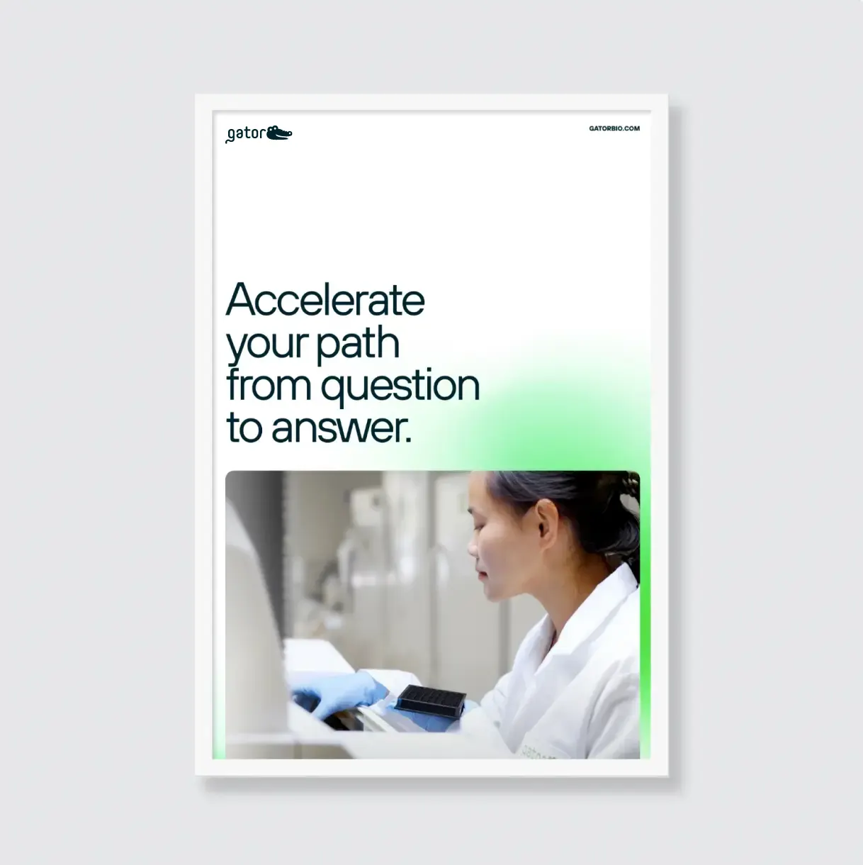
Usage Examples
The examples below show two ways the gradient can be incorporated into layouts.
Gradient as a background element
Gradient as a foreground element

Crop into the gradients to suit your layout. Rotate and scale them as needed.
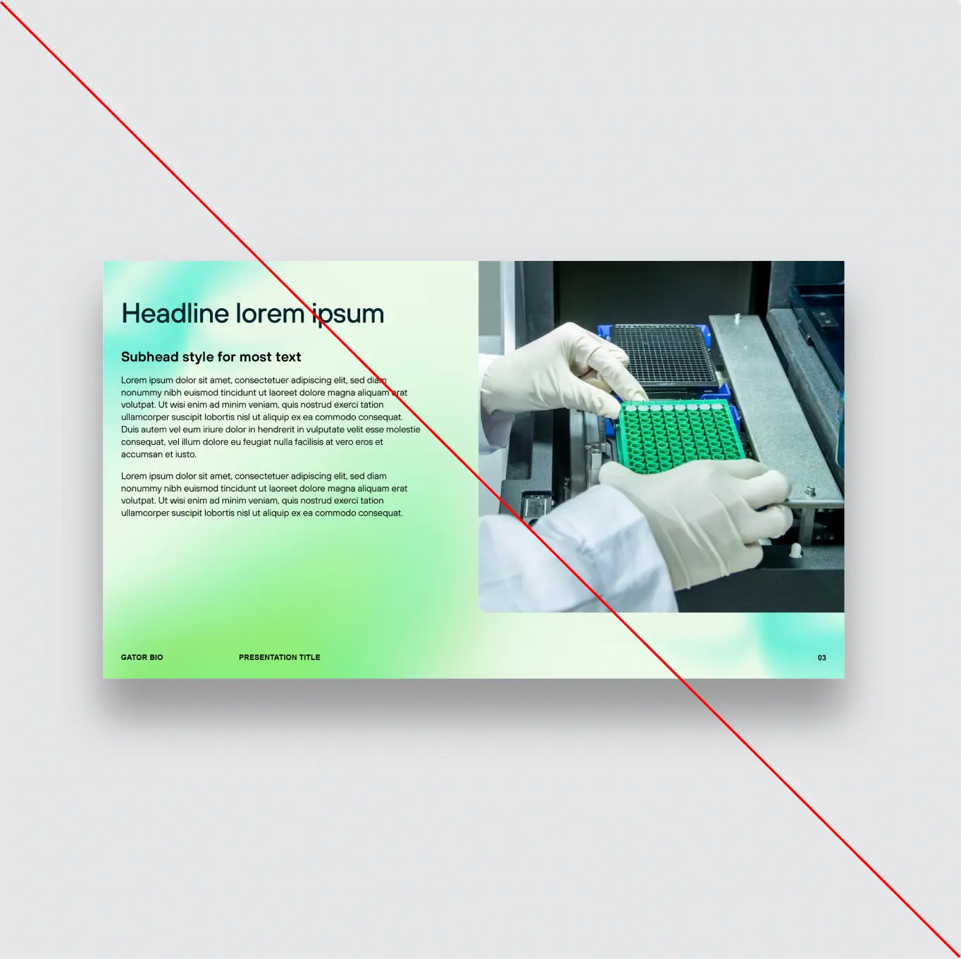
Do not overuse too many gradients in a single layout.
Icons
We have two icon styles for our brand system that are used based on the scale and desired intention within layouts.
Medium scale icons: These two-toned monoline icons are created to be used at a medium sized scale as key focal points within the layout.
Small scale icons: These single-color monoline icons are intentionally reductive in terms of color and detail, with the intention to be used at a smaller scale as minor supporting element in layouts.
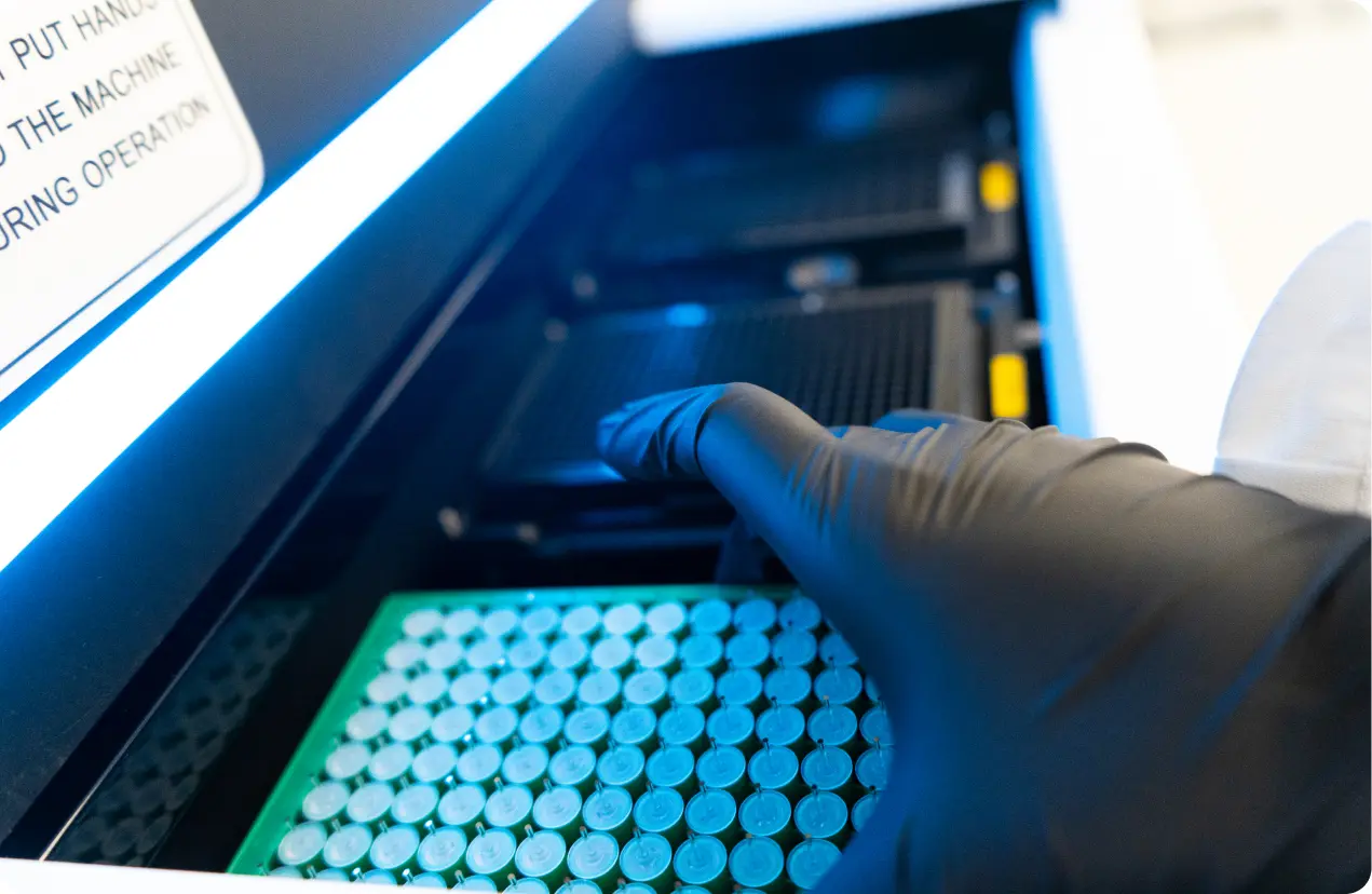
Photography
We strive to capture the professionalism and innovation that occurs
at Gator Bio while also conveying the human, warm and approachable
people that make our culture great. Our photography celebrates both
the collaborative people-focused scenes as well as textural macro moments and everything in between, that collectively tell the story of what we do.
People
Our imagery of people should feature natural expressions. Pleasant, focused, and thoughtful. Avoid forced smiles and direct-to-camera faces.
Our team is rich and diverse in gender, age, and ethnicity and our images should reflect that.
We work both individually and collaboratively. We have a mixture of mindful engaging moments as well as casual social hangs. All situations have a place in our image library, rooted in professionalism and always naturally and comfortably posed.
Attire should appear new, modern and project professionalism. Utilize solid simple colors and avoid overly busy patterns. Color should either lean into brand color palette, or toward neutral colors and muted tones. Keep accessories and jewelry minimal, or skip altogether.
Backgrounds and settings
Backgrounds of images should feel uncluttered and not distract from the subject. Avoid messy workspaces or overly busy backgrounds.
Settings should be a mixture of in office, on campus, and culture building environments (off location when appropriate).
Scenes should be cleared of personal items and clutter, trash bins removed, whiteboards erased.
Composition
Images should feel authentic and shot at eye-level. However, a subtle mixture of eye-level vantage points (low, mid, high) can create visual interest and are encouraged.
Compositions should feature a clear focal subject, so you feel like you are in the room with them. The situation should feel composed but not posed.
Light, color, & focus
Lighting should be bright, even, and natural. Avoid overly harsh shadows.
The brand color palette is encouraged to be subtly woven into imagery when the opportunity lends itself. For instance, in a lab setting, choosing color coordinated gloves and clothing in the photograph instead of clashing colors would be ideal. However do not force brand colors into scenes that feel unnatural and/or distracting.
Subject matter should be crisp in focus and shallow depth of field is encouraged for background elements.
Motion blurs and reflections off glass–when appropriate–can inject a dynamic sense of activity into mundane scenes.
People
The innovation of Gator Bio is captured through the expressions, body language, and collaboration of the team members in our photographs and the respective technology shown with them.


Instruments
Our product photography captures the precision, innovation, and integrity behind our instruments. Each image is designed to reflect the advanced engineering and scientific rigor that define our work, while artfully capturing the beauty in the details.